A Week with Windows Phone 7 -or- A Week with the HTC 7 Mozart
I've been a gadget fan as long as I can remember. When I was at school, it was not cool at all to be into electronic toys or computer games. I didn't care though, I loved it all and although it may have cost me any chance I had of being 'cool' I was pretty happy. These days, gadgets are mainstream. Magazine shelves are creaking with the likes of 'Stuff Magazine' and 'T3', all further pushing the notion that gadgets are part of a modern 'lifestyle' and that being seen with the right gadget is just as important as wearing this year's colours or labels. I don't mind this shift at all, in fact I'm now the go to guy for stuff that is 'cool'!!! Given that I never understood clothes or football, it's nice to finally have something!
Anyway, I digress before I've even started. No gadget is more part of a modern lifestyle than the mobile phone and now, the 'smartphone' really is the thing to be seen with.
Smartphones are like gadget sponges - sucking in functions and technology from gadgets around them and making all else seem obsolete! A bang up to the minute smartphone will happily replace your:
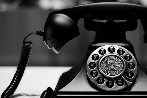
- Landline
- Internet Connection (with full web-browsing)
- Camera
- Satnav
- Games Console (or at least your portable one)
- Alarm Clock
- Email / Twitter / Facebook
- Video player (and yes, some will output to the TV!)
and much more!
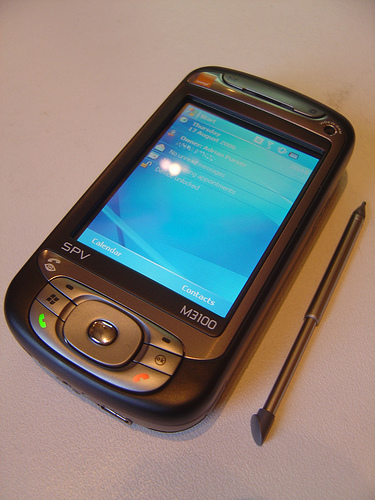
I've been using smartphones since they were for geeks only and back then (early 2000's) Windows Mobile based phones were the most popular and boy, they were horrible. Microsoft in their infinite wisdom basically decided to shrink the traditional Windows desktop interface onto a device with a two inch screen and have you poke and prod at it with a cheap (and easily lost) plastic stylus. I was so enthralled with the idea of having my calendar, email and contacts synchronise with my computer at work that it was a good fortnight before I realised I hated it.
Although Nokia has quietly gone on to develop the most popular smartphone operating system "Symbian", it was really Apple with the iPhone that finally made smartphones fashionable, but more importantly, a pleasure to use.
Apple are now on their 4th version of the iPhone (the 5th is expected in a matter of months though) and also the 4th version of their operating system IOS. The Apple iPhone is our supported smartphone at work and although we had some debate over it, primarily due to the cost of a two year contract, it's been a great move. Users are very happy with them and, just as importantly to me as an IT Guy, even the most novice of users are up and running within minutes. Very few come back to us having got stuck. I won't miss Windows Mobile 6 at all!
Since then, Google developed and released 'Android' into the phone world. Apple keep IOS all for themselves, but anyone could develop a phone around Android and not have to pay Google a penny. Lots did and now Google register over 300,000 devices running Android every single day! (Source).
I've been using Android phones as my personal device since they first came out in the UK. Where Apple's interface consists of a simple grid of icons, which you tap to open that particular program (or app as they're known), Android gave you widgets! Widgets are little graphical representations of your apps which give you information without having to open the full program and with Android you can have several widgets open at once. For example, on one screen, I had the Twitter widget and the Facebook one. The twitter one would show the most recent tweets and Facebook would allow me to flick through recent status updates. If I want the full software, a single tap takes me straight in. The beauty of Android is you really can set it up to look how you want it and personalise the whole experience and the applications support in the marketplace, whilst not as extensive as Apples, yet, goes from strength to strength.
It was with absolutely no interest then that the launch of Microsoft's attempt to re-enter the smartphone world passed me by late last year. 'Windows Phone 7' as it's called is a ground up rewrite of Windows for mobiles and they've already got the support of the likes of HTC, Motorola and Samsung who have all released phones with Windows Phone 7 onboard.
It was the phones themselves that got me interested. Microsoft set the minimum hardware specifications for devices running Phone 7 and boy are they good. I won't get into the jargon here, but these phones sounded like they were going to be QUICK! There is nothing more frustrating than a clunky smartphone, so, with growing interest I wrote to Orange and got hold of an evaluation.
So for the last fornight I've replaced my trusty (if creaky) Android based HTC Hero, with an all-singing-all-dancing HTC 7 Mozart.
I'll keep my comments on the hardware brief, but basically you get a nice big 3.7" screen with a decent resolution of 800*480. The camera has an 8 megapixel sensor, which is pretty good for a smartphone right now and it's light for its size at 130g. Although perhaps not as attractive as an iPhone, it looks impressive and feels very well built.
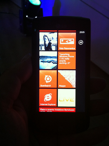
So what of living with Microsoft's new operating system? Well, with a few reservations, I think they have a potential success on their hands! Where older versions of mobile Windows would attempt to emulate an entire laptop on your mobile, this effort has been stripped right back to basics. Your main screen consists of a two column grid of large, pastel coloured, 'tiles' which represent different functions. So you have a link to the 'Phone' screen, another to your texts, yet another for an email account and so on. The titles have very basic icons on them so you know which is which and each will update to let you know if you have messages waiting. After having an Android phone with it's attactive widgets, I wasn't impressed at first, but soon the advantages of the pure functionality started to win me over.
On the move, this phone is so easy to use. The big tiles mean I can easily check for any updates in a flash whilst on the move and they're easy to tap and navigate, even whilst walking at a quick pace along the street. Any installed program can be a tile and it's up to you which ones are pinned to this list. When you need the others, a swipe to the left pulls up a list of all the other apps in alphabetical order.
The apps themselves look great, even emails, which have almost no graphics look cool with the way the text swooshes into view and back out. Everything is super clear and super quick and has obviously been designed to get the job done with a minimum of fuss. I can see the business world in particular getting on very well with the interface, where efficiency is much more important than being 'pretty'.
Finally, the phone integrates very nicely with Facebook and other social networks. The 'People' tab merges your phone contacts with your Facebook list, your Windows Live contacts and more so when you tap on a contact, you'll not only get the usual options about texting or emailing them, you'll get their latest updates too! I've found I actually prefer checking these updates on the phone rather than via some of the actual websites!
So is there anything about Windows Phone 7 I don't like? Yes, there are a few things.
During the initial setup I managed to get totally confused. I clicked on the 'Email' tile and was given a list of email providers that I could pick my own out of and have my email set up for me. I chose 'Google' and within moments there were all my emails. So far so good. Next I thought I'd have a look at the calendar. Again, I'm given a list of providers to choose from. Well, I'm a bit of a google slave, and yes, they have my calendar too, so I opted for Google again, only to receive an error saying I'd already set up Google and I must choose another. It was ages before I realised I had to come out of the calendar, go into 'Setttings', find the Google account and elect to also synchronise my calendar. It should have been much simpler than this. I was so annoyed at the time, I thought I would be writing a very different review.
My second bugbear is the keyboard. Both the iPhone and Android keyboards dynamically correct most typing errors for you, so generally you'll find that you won't stop each time you see you've made a typing error, because you can be confident that the phone will catch it. Not with Windows Phone 7. After 2 weeks, I'm still very stilted with the typing as I have to constantly pick from several 'suggestions' rather than the phone knowing which word I meant. Android is definitely far ahead here, particularly because if you don't like the keyboard, you can download another one from a different developer! And there are some very good ones to try out there.
My final bugbear is the MarketPlace. The phone's onboard software is very nice. I really like using email on it, the calendar is too basic, but it gets the job done and having versions of the Microsoft Office suite onboard set it apart from IOS and Android, but ultimately you're going to want to download more apps! And there just aren't that many out there. This is bound to change, Windows Phone 7 has only been on the market for months, not years like the others, but it's something to watch out for.
So would I change to Windows Phone 7? I'm definitely tempted, but for me Android still has the best mix of functionality and fun and the pace of development means it's improving all the time. I'll be back to see Windows Phone 7 as the updates and fixes start to appear and I definitely think it will have what it takes to compete, at least in the business market.
Jp
Photo Credits (all Flickr Creative Commons)


