Penultimate Vs MyScript Notes Vs Notability Vs Noteshelf
(Ed: A newer post is now available reviewing notation apps here)
I work as a Systems Analyst in a large IT department at a University. There are more than 100 staff supporting and developing the IT infrastructure, which ranges from data centres full of servers performing all sorts of computational research, down to making sure the iPhones are picking up email. As you can imagine in this environment, gadgets are everywhere. Most of my colleagues carry a smartphone, many have a tablet (as often Android based as an iPad, techies love Android) and a nice laptop. Not only are they needed to keep everything going, but people like me really like using this stuff.
However, there is still one room where the gadgets are surprisingly absent and that's the meeting room. Yes, there is a PC wired to a projector and a digital whiteboard, but everyone has in front of them a paper notepad and a pen. Not very high tech you might think, but it's an age old 'technology' that's well proven. The written word is not dead, and speaking with my colleagues, I can totally understand why.
Whilst typing speeds would easily allow us to keep up with what is being said in a meeting, a laptop with its vertical screen puts up barriers between speakers and the clicking of the keyboard, especially if there is more than one can get annoying. Not to mention all the distractions that a laptop can display. Twitter may often be more appealing than the discussion at hand, but it doesn't look very good!
So the technology is there to replace pen and ink, but the culture isn't. Handwriting notes during conversation feels more natural and you don't feel as cut off from the conversation as you do it, not to mention being able to doodle!
My problem with handwriting is that the notepad itself is only good for referencing back a few days before it becomes a pain. Typed notes on a computer can be copied and pasted, shared with others, searched easily and edited all with great efficiency and for these reasons, I'm the guy who will turn up to a meeting with an iPad instead of a laptop or a piece of paper. You see with an iPad I can get close to the best of both worlds.
One of my early reviews where I talked on this subject has dominated my blogs stats ever since, and that was my review of the Penultimate app and Griffin stylus. It seems many of you are just as interested as me in the idea of using a tablet to take handwritten notes.
Penultimate was brilliant and I was initially very happy with the stylus, which, although a bit like writing with a crayon due to its big spongy tip, allowed me to get even closer to my paperless ideal.

Of course time marches on and innovators like Adonit have since come along with their 'Jot' range of styli and my purchase of the Adonit Jot Pro really has brought a ballpoint-pen like experience to digital notation, as well as another popular blog post.
It's not just the hardware that has improved. Penultimate now has competition and I decided it was time to hop back into the app store and see if any of the alternatives had what it took to beat Penultimate and become my new notepad of choice.
Since there are so many notation apps in the app store now, I narrowed down by only downloading those that seemed to have a unique selling point (USP). I've spent at least a week living with each one shall now see which I will choose as my 'forever notepad' (well, at least for a while).
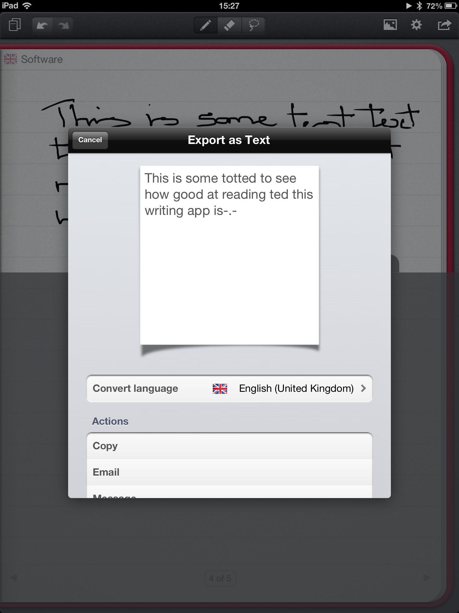
First up is the one that had the most interesting usp. I'm often asked if my handwritten notes can be converted to text (I.E. optical character recognition or OCR). Something that Penultimate doesn't do, but 'MyScript Notes Mobile' (Notes) claims it does.
Notes opens with a clean and intuitive interface. You can store multiple notepads, so it's easy to have one for each project you're on for example. Give the book a title, choose from a range of covers and then what kind of lines you want the paper to have. All fairly typical of these apps, but it looks nice and so long as you don't want hundreds of different notepads, the single horizontal list of pads can be swiped through until you find the one you want and a single tap opens it on the last page you accessed.
Once you've opened your notepad, the screen is dominated by the page, ready for you to get down to writing. The narrow menu bar at the top allows for some simple stationary changes. For example, you can change the colour and gauge of your 'pen' and move to an eraser to wipe out your mistakes and doodles. Down at the bottom is a little arrow, which if you hold and drag up allows you to set the 'wrist protection' area so the app only recognizes your pen, rather than making a mess as your wrist rests behind it. This is a system that works, but I didn't like having to constantly stop after each line or two to move the wrist rest down a bit. I would have forgiven this in a moment had the text recognition been accurate, but unfortunately I didn't have too much luck with that either.
This is quite an expensive app at over £5 and although I must confess to rather poor handwriting, I do wonder if, unless your scrawl looks much like typed text in the first place, you'll be disappointed too. More disappointing still is that even if you get on well with the text recognition, Notes only reads and exports one page at a time, not multiple pages or a whole book, which severely limits its usefulness. If you'd like to try the text recognition, look for the 'Memo' app on the App Store, which is free from the same people and will give you a taster without any outlay.
Another USP I often get asked about is the ability to track and record the meeting as audio, as well as taking written notes. This is a rather interesting idea, as if the conversation is quite lively, or you happen to drift off part way through (admit it, you've done it), there is the opportunity to go back and listen to sections again.
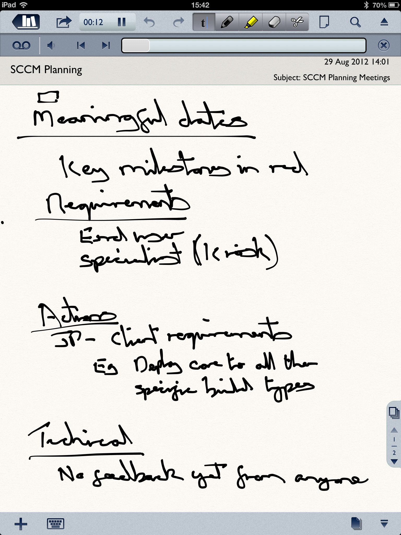
After scanning the App Store customer reviews, I settled on Notability, which seems to spend a lot of time in the charts and makes a big thing of its ability to record the meeting as well as offer handwritten notation. I'll say right now, I was impressed with this one, but first the basics. The front menu will be familiar to anyone that uses Windows Explorer. Down the left side, you have your folders. Tap on a folder and down the right column you'll get your notes. It works well and for those who take notes on a range of subjects, it makes for an excellent reference to hunt things down later on. It's not as pretty as a virtual bookshelf, but it's not all about the prettiness, right fellow iPad owners?
Just like Notes, once you're in, the screen is dominated by the virtual page all ready for your scribble. Again, limited options are available for changing pen colour, or changing to keyboard entry and so on. I must admit that, although satisfactory, I found the actual act of handwriting to be less appealing in this app than the others. A slight lag in the ink took a bit of adjusting to, highlighting the responsiveness of the competition, but after a few days, this didn't seem to matter as much. Where this app stands out though is the audio recording, which it does very very well.
Controls are simple, simply tap one button to record and another to stop. So far, so good. When you come to reviewing your notes and the audio, things start to get really clever as I found out in my first meeting back in August. It was a warm day and the meeting room was stuffy, so on went the massive air conditioner above the large meeting room table. The meeting had 5 people present. We were round a table that seats 16 and spread out, moving between the table and the white boards on the wall. I was quite concerned that the iPad, which needed to be right in front of me so I could write on it, was not best placed to pick all the conversation up.
I needn't have worried. It got everything, including that damned air-conditioner! I was almost as disappointed as when I failed to get on with the text recognition in Notes, but Notability has a few further tricks.
As you can see in the screen above, you can tune the audio by frequency. It sounds more complicated than it is, but you can play around and get a feel for it, but it's that bottom slider that worked the magic. By dragging the slider to the right, I was tuning the app towards vocal frequencies. The other direction boosted the atmospheric ones. I could pretty much dial out the aircon and be left with the voices! Amazing. If the ability to record audio is important, I think this is your app and it will definitely be staying on my iPad, but will it be the only one?
Going back to the App Store, I noted (pun intended) that the real limitation with the iPad as an excellent handwriting tool was its multitouch screen. We only want it to recognize the pen, but it's designed for fingers and lots of them! This time I wanted to find something that let me concentrate on the writing and not fiddling about with a manual wrist-rest. Penultimate does this, but it's flawed and something I hoped could be improved upon.
Stepping up to the plate with this feature is NoteShelf, an app which at first glance looks like it might have been written by Apple itself! The opening screen is very reminiscent of iBooks as you're presented with a nice looking virtual wooden bookshelf (a planer interface is also available wood-haters), with each of your notepads lining the shelves. A nice touch is that you can stack books 'deep' as well as across, so having the equivalent of sub-folders to keep multiple books under one subject together. It works well and will appeal to iPad owners who will admire the aesthetic of the app too.
This focus on design appeal extends to the open books too as a range of virtual stationary is available to choose from including a nice range of pen colours, each of which can be customised (see below) so you can have a virtual box of almost any colour you can imagine. There are also a similar range of highlighters and erasers, along with the usual ability to cut and paste, import pictures or switch to the keyboard.
Noteshelf is incredibly responsive with little 'ink lag'. They've also worked hard on making the ink look like it's responding to your strokes, so fast sweeps thin out the line and slow draws are thicker. A recent update adds a real calligraphy feel that might be a matter of taste, but I really like it.
It might be coming across that I am keen on Noteshelf. It's nice to look at, easy to manage and responsive. But what of that wrist guard, after all, Noteshelf is one of the only apps to look after this for you? Well, it falls short of perfect, but I'm willing to call it excellent.
The wrist guard shows you where it is by means of a small 'grip' on the right hand side. You can drag this up and down the page to set it, but as you write, it will position itself automatically. For the most part, it gets things right, although a colleague who had a more unusual way of holding a pen caused it a bit more trouble, but when it moves off in error, it takes a second to bring it back. It's a fine attempt and something I hope will only improve with each subsequent update.
It looks like Penultimate, which I raved about back in 2011 has some real competition then! For integrated audio recording, Notability has earned a place on anyone's tablet. Whilst the text recognition isn't quite there, Notes is a reasonable attempt and one that I'll revisit with each update in the hope of improvements. Once they nail it, it will be another recommendation, but for now it's expensive and not quite there.
Noteshelf is fantastic. A polished and complete product and whilst Penultimate hasn't rested on it's laurels, its wrist protection has now been bettered, as has its display of your various notebooks.
Yes, it's time to move on. Noteshelf is now my go-to digital notepad of choice and whilst we wait for text recognition to get better, I recommend signing up to EverNote and exporting your notes to that whenever you want to index and search. It includes excellent optical character recognition for both handwriting and text that appears in photos (for example a photo of a business card from your meeting). In the quest to go paperless, we're now close to the ideal... I wonder if, in a few years time, my colleagues will also have ditched the pen for the stylus?
Update
A suggestion in the comments section led me to revisit the four apps to look at a function I'd never used before, the 'Zoom'. The idea of zoom is to dedicate the bottom section of the screen to a close up of the page and allow you to write and doodle fitting more of your words across a line than writing direct to the page. I spent the last week taking each of the apps to meetings and working only with the zoom function. Testing of Penultimate and Notes went pretty quickly since they don't offer this feature at all, leaving just Noteshelf and Noteability to compare.
Both take a similar approach, sectioning off the base of the screen and adding a few controls to allow you to set the zoomed area and move around conveniently with minimal interuption to your note-taking. However, it's NoteShelf that continues to remain ahead with the most polished experience, control and responsiveness to the stylus in this mode. Noteability actually stuggled on many occasions with the stylus strokes lagging a bit with my actions enough to distract and having to manage the wrist guard along with the zoom controls proves annoying. If the zoom function is important to you, the best overall app, NoteShelf also has the best implementation.
Photo credits:
Posted with Blogsy


