Pebble Time Review - Should You Upgrade From a Pebble Classic?
It’s my solemn opinion that the original Pebble, the ‘Classic’, is the best smartwatch on the market right now. Yes, I know it comes comfortably last in any typical tech performance comparison with its peers. The processor is slow, the screen a tiny black and white affair and have you seen the graphics? The original Nintendo Gameboy wouldn't feel threatened. But my original review was glowing and I stand by it.
The original Pebble Classic, which I still wear every day and charge every 5
However, it succeeds as a watch beautifully, with few of the compromises self-inflicted by the competition, as they try to replicate as much of your smartphone as they possibly can.
Battery life measured in days, rather than hours? Check. Watchface always on? Check. All your notifications, a few neat apps and well made enough to come swimming with you? Check, check and check.
So when the Pebble Time was announced with more performance, memory and a colour screen, I was unusually sceptical. Does upping the tech necessarily make for a better watch?
Familiar Territory
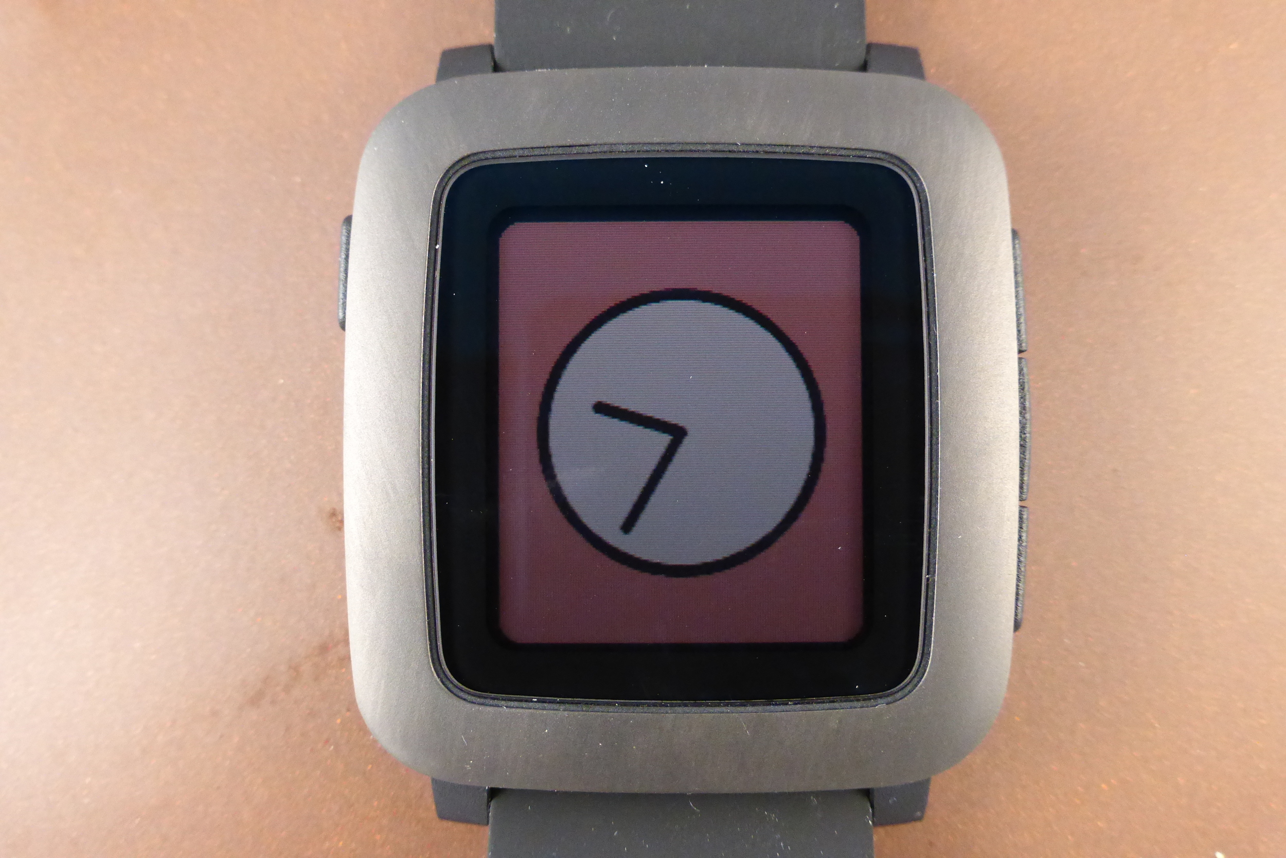
The Pebble Time running my favourite watchface. Doesn't exactly sell the colour feature, but I like it
Opening the box brings relief that Pebble appear not to have forgotten their roots and Pebble Time exudes a simple retro charm. You could say it feels more grown up than its brother, perhaps making the old one seem a little toy like?
“This watch doesn’t want to be compared to an Apple or Android watch”
Powering-up brings the colour screen to life, but there is less of the wow than an Apple Watch achieves. The colours are few and muted, reminding me of the first Gameboy Advance. The contrast is also poor (making it harder to read at a glance than the Classic) and the pre-installed watch-faces are very simple indeed. On the flip-side, animations are fun and they remind you that this watch doesn't want to be compared to an Apple or Android watch.
I find it hard hard not to.
I think the problem is that Android Wear watches have had colour screens since day one and the Pebble going colour raises expectations. Although initially unimpressed, I did warm to the screen and continue to marvel at a smartwatch that doesn't ever have to switch off its screen, but can run for a full week (something I tested and can vouch for).


The rest of the watch will be familiar to existing Pebble owners and nice and intuitive to people investing in their first smartwatch. Three buttons down the right hand side allow for direction and select through the vertically stacked menus and there is a ‘back’ button on the left hand side that will also switch on the light when you need it. Buttons still beat a touchscreen when it comes to smartwatches, at least for me.
The software has been through a significant overhaul and there are some clever ideas. Once you have your watch picking up your calendar and emails etc, the watch builds a timeline through which you can easily scroll through. Click forwards in time to see appointments, birthdays, events, that sort of thing. Roll-back to see old messages and so on. It’s slick and genuinely more practical than pulling your phone out between appointments (as well as reminding you to go to them!). It also beats hunting through apps on your watch to get the information you need - apps can feed their info right into the timeline.
Whilst we’re on the subject of apps, the Time can hold many more than the Classic, the 8 app limit has been removed.
Rumour has it that the old watch will get this new software too, but the wait continues.
Day to day, living with the Pebble Time is very similar to owning a Classic. It’ll connect to an iPhone or Android, something an Apple Watch can’t do (but Android Wear watches now can) and will pass notifications over from all your apps, or just the ones you wish. You can set up some canned responses to quick-fire back at texts, WhatsApp messages, emails and so on and there is even a microphone to allow you to dictate a short response or take reminders. Alone, I could pretend to be Dick Tracy speaking to my watch. In public I instantly felt like a dork and stopped doing it. Nice to have? Yes, but not essential.
By the end of day one, I realised that the Time is much more comfortable than the classic. It sits more nicely on my unnecessarily-small-for-a-man wrists and it’s not as deep, so doesn't fight with shirt cuffs and layers of clothes in winter. Apps also run quicker. I have to be quite patient with WunderPebble on my Classic, which allows me to manage my To Dos on Wunderlist. On the Time it just blasts along.
The Smartwatch Killer App
Whichever model you have, it's the notifications that provide the real use
Many people claim that the smartwatch is still looking for a ‘killer-app’ before the masses will truly buy into it. I think the killer-app is the notifications, which maybe aren’t a marketing person’s dream, but it really is nice to not pull out your phone to check for alerts, except when you know you need to. I’ve grown very used to my Pebble Classic allowing me a quick glance at an alert without breaking my general concentration on the task at hand. During my week with the Time though I decided that the next software update should bring with it the option to switch off the animations. Cute and well-designed though they are, they add about half a second to the time it takes to check a notification. When the Classic vibrates and you glance down, the message is there and you can recognise its importance in a heartbeat. When the Time vibrates, you have to watch those animations run their half second and then check your message. This is far too long when you’re interacting with other people – it just looks rude and it generally becomes more and more annoying, even when you’re not.
Verdict
Looking back, this review smacks of disappointment. It’s not that the Time isn’t a neat smartwatch. It is and it keeps a lot of the traits that make the original a great watch, whilst adding a more grown-up design and that neat timeline feature – but somewhere along the line it hasn’t quite met with expectation for me. £180 seems a lot when the original can be had for £99 (and many Android watches are comparable in price), it’s hard to say it’s great value for money and if you don’t like the big-kid friendly charm of the Classic, then my recommendation would be to check out the Pebble Steel. At £150, it represents a nice mix of sophistication and the black and white screen just looks understated rather than old fashioned.
Final Thought
If you really like the styling, since I had my review model, there have been software updates that allow you to brighten the back-light, helping with that screen contrast – although at expense to your battery life. I can imagine there will be many more, further refining the clever software and removing some of the niggles. The Pebble Time may not be a classic, but it is a contender.
Have you upgraded from a Pebble Classic to a Pebble Time? Let me know how you found it in the comments.
p