iPad App Review - ToDo for iPad
 As my iPad passes a year old, I'm pleased to report that it's doing an excellent job of helping me go paperless in the office. Whilst the cost and environmental benefits are obvious, my prime motivation was to be able to replace the notepad that I usually take to meetings with an iPad and benefit from having all my documentation, plus my calendar and mailbox immediately to hand, ready for anything that the meeting's discussion threw my way.
As iPad owners already know, the ipad makes for an incredibly easy way of keeping on top of your calendar and email. During any downtime at work or when travelling from A to B, it switches on in an instant like a smartphone, but that big comfortable screen allows you to read and sort emails and meeting requests with the same level of comfort as a laptop, without all those lengthy start up times! I've also had a great experience with 'Dropbox' (my review here) that holds all my documents and keeps all my devices synchronised and 'GoodReader' (my review here) that allows me to keep local document copies on the ipad and annotate them when I need to. Finally, my most recent aquisition, a griffin stylus and the Penultimate app (my review here) have allowed me to handwrite and scribble into digital notepads when the need has arisen. Although the iPad is not designed to work with a stylus, and the griffin is not perfect, it does the job well and I'm a regular user. The iPad together with these affordable apps has become an indispensible office tool and even when I am given a piece of work on paper, it's immediately scanned to my email account ready to store in the ipad.
However, there was one last critical piece of work that I wanted to transpose across to the iPad in a way that equalled, or hopefully bettered how I was doing it before; the humble 'To do' list!
I use Outlook at work, which synchronises with the Microsoft Exchange Server and up until I got the iPad, I'd been using 'Outlook Tasks' to manage my to do list. This had been working fine for managing a single list of tasks, but as my remit expanded and I started to take part in more and more projects, I started to realise that something a bit more comprehensive was required. It also gave me a reason to forgive the iPad for not supporting Outlook Task synchronisation, which is no doubt quite frustrating for many business users.
The very apptly titled 'ToDo' app for the iPad by Appigo (their product page is here), was about the third task manager that I tried on the iPad. I actually bought it by mistake after reading a comment in a forum that erroniously stated that it synchronsied with Outlook tasks. At the time, I wanted to carry across my existing list in as convenient a way possible - so let's just say ToDo was not off to the best start with me when I discovered it couldn't do that.
I decided to persevere however, I'd paid for it after all and found a very well presented, well thought out and polished little app.
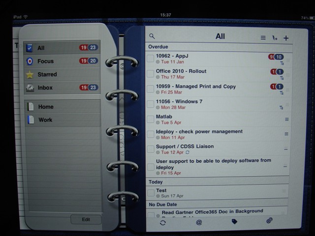
The main look and feel is based around a ring binder interface where the left hand page shows you all your different lists ('Home' and 'Work' are provided, but you can add your own, plus links to your starred items, or ones that you've applied a 'Focus' on).
On the right hand page you'll see your list of todos in detail and at the top right are your quick links to add and search your lists. Finally across the bottom of the right hand page, you'll see links to the settings page, tag creation and synchronise options (more on these later).
Adding a task or todo is simplicity itself. Tap the '+' symbol and you'll be asked to select what type of task you're about to input. I pretty much always use 'Normal', but there are options to set checklists, or reminders to call, email or SMS a contact, go to a physical location or visit a particular website. These may or may not be useful to you, depending on your role, but they certainly have the bulk of the bases covered. Finally, you can enter a project here, which will allow you to group tasks away under specific subheadings. For me, this has been particularly useful, as one long list could look very daunting, but breaking it down into groups this way helps me manage my time much more accurately. In meetings, having this view of my workload enables me to answer questions about my availability with much more certainty and if I am challenged, I can list out exactly what deadlines I have approaching and make it a Management decision about whether or not their new task is priority or not.
Anyway, back to the app and a 'normal' task. Once a name is given to the task, for example "Download all required files for software upgrade", tap 'Save' and then a familiar pop-up box to anyone who has ever added a calendar appointment to their iPad appears. You can now optionally enter details for your task. First you can fill out some notes if your task needs some background detail, then set the due date and time. A very handy feature is setting a 'Repeat', which I do to remind myself to plan for several recurring meetings that I have. Finally, you can set priority (high, med, low, none), a list (eg work, home or another that you've added yourself), tags (useful for searching, but not something I've used) and set a reminder alert (something a paper pad can never do!).
Once you're done, tap outside the pop-up and it will close, leaving you with your new tasks added to the list. I'm surprised there isn't a 'Save' button to do this, but once you know it does save those settings, it's a minor interface flaw.
After a few days at work adding tasks, your right hand page will start to grow. It's pretty handy then that the page will automatically apply some simple grouping to your list to help you see at a glance what might be your next priority. Overdue tasks are shown first and projects that have overdue tasks in them will have the number running late shown in red out of a total shown in blue. You'll then see a list of tasks due 'Today', 'Tomorrow', 'Future' and then 'No due date'.
And that's really all there is to it. Personally, even when I didn't necessarily need a to do list to get through my working day, I found it gave me some reward to get through a day at the office and see just how many tasks I'd chalked off. Ticking off a task in 'ToDo' is a simple case of tapping the empty box to the left of the task, which will see it greyed out and moved to the 'Completed' list, where it will stay until deleted entirely according to your settings.
The 'Settings' section is very simple. You can set different methods of sorting (mine is set first by due date, then by priority) and you can apply different themes to personalise the look of your app.
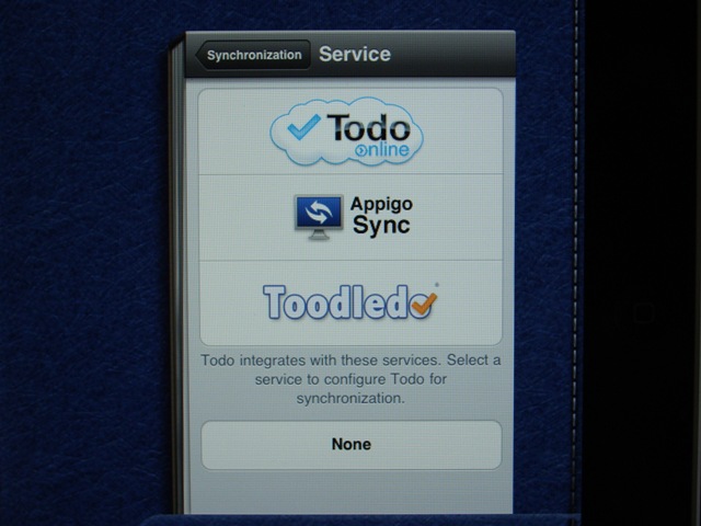
One setting I do recommend is visiting the 'Synchronisation' settings where you can choose from three different online services to synchronise against. ToDo online and Appigo Sync are both affiliated with the app, but I went with the last option 'ToodleDo' (Website here). I must admit, firstly because although not very pretty, it was free and I only wanted it to back up the ipad list. However, with use, I've found ToodleDo makes for a great way of managing my tasks when I'm at work using the desktop computer and it perfectly compliments the ToDo app on the ipad when I'm out and about.
All in all I would say that ToDo rounds off my attempts to finally achieve a paperless office with aplomb and is a must for anyone trying to juggle a busy workload across different projects and, although I don't, I think it would make a great tool for running a busy home too!
Jp
Photo Credit (used under Creative Commons license)


